38

I really love the beautiful shaded TeX.SX logo — I think it makes tex.stackexchange.com one of the best looking of all the StackExchange sites.
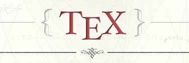
But I am curious why the kerning is wrong? (By that I mean it doesn't follow Knuth's kerning of the TeX logo.) Should it not look more like this?—
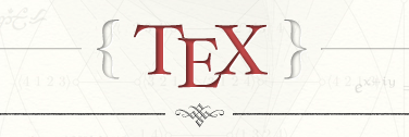
The latter shows the E lowered by 1 pixel and the T and X each moved 6 pixels closer to the E. It's subtle, but it feels more "TeX-like" to me that way. Anyone agree/disagree?

8
  • 13
    It's good to see them next to each other. The properly kerned one gets my vote. @jin, any chance of fixing this? Commented Jan 24, 2012 at 23:08
  • 17
    Nice finding! :) On a funny note, we need a new swag package with the proper kerning in the logo to be resent to all top users; this time I'm in the second page. :P Commented Jan 24, 2012 at 23:36
  • 1
    I'll fix this. I tried to mimic the kerning as closely as possible from what I saw on the web when I designed the logo. The community didn't object to what I had so I assumed I did it correctly.
    – Jin
    Commented Feb 3, 2012 at 3:55
  • 1
    @Jin Speaking for myself, I wouldn't have noticed if no-one had brought it to my attention, but now that someone has, it glares out at me. Thanks for fixing it. Commented Feb 3, 2012 at 7:56
  • 2
    I hadn't noticed it myself until I hand-kerned a version of \TeX, \LaTeX, and \XeTeX for HTML text using CSS in late December. Then it suddenly stood out to me. It's really funny how that works...once you see something, you really can't un-see it. Commented Feb 3, 2012 at 11:58
  • 2
    @AndrewStacey imgs.xkcd.com/comics/kerning.png
    – Seamus
    Commented Feb 12, 2012 at 12:47
  • Now we need new [swag packages][1] with the correct kerning. [1]: meta.tex.stackexchange.com/questions/1837/…
    – topskip
    Commented Feb 29, 2012 at 9:44
  • ... not meant to be taken seriously
    – topskip
    Commented Feb 29, 2012 at 9:57

2 Answers 2

23

I have deployed a fix for this on dev. It will be live after our next production build. I put cache breaker in css so no need to hard refresh browser to see the new logo change.

5
  • Cool — can't wait to see it! Dumb question: how does one view the dev site? Commented Feb 3, 2012 at 14:13
  • @ToddLehman you can't. it's for me only :)
    – Jin
    Commented Feb 3, 2012 at 16:09
  • @Jin I can see the fixed logo now. It looks nice. Did you make the shadows inside the letters stronger too?
    – N.N.
    Commented Feb 3, 2012 at 21:06
  • 1
    @N.N. I tweaked the angle of the inner shadow a bit. It's a straight cast from top now, before it was slanted angle.
    – Jin
    Commented Feb 3, 2012 at 21:59
  • 4
    @Jin Thanks for the fix! It looks like the braces now are further away from the TeX -- could they be moved a bit towards the middle?
    – doncherry
    Commented Feb 4, 2012 at 22:06
27

Here's the logo as defined by DEK at \magnification 6000 run from plain.tex. Judge for yourself.

original TeX logo, magnified to 60pt

Addendum: DEK wrote a brief article for TUGboat with his recommendations for "correcting" the kerning for the logo in different (cm) fonts. He also mentions some (limited) experiences with non-cm fonts.

8
  • Exactly! Tighter kerning. :) Commented Jan 24, 2012 at 22:33
  • 9
    I've got to go with @ToddLehman on this one, his version looks more like that then the one at the top of the screen.
    – Canageek
    Commented Jan 24, 2012 at 23:03
  • 4
    If only you'd written this with capital letters at the start of sentences, we could have regarded it as the Official Line on how to write TeX! Commented Jan 25, 2012 at 9:54
  • 7
    @Andrew -- oh, okay. i guess this one's non-controversial enough to be considered official. Commented Jan 25, 2012 at 13:16
  • 7
    Great! Now we can tell @Jin that it's official that the design is wrong. Commented Jan 25, 2012 at 13:29
  • 2
    Wow, I assumed the edit wasn't from barbara! but if I understand what the page was telling me, it was. I didn't know she had any capital letters on her keyboard. Commented Jan 26, 2012 at 17:23
  • hi, @David. i actually do have capital letters on my keyboard, but i can save a keystroke now and then by not using them. <g> Commented Jan 26, 2012 at 17:39
  • I once had an edit denied because I went through and added capitals to one of your answers, not knowing that was a stylistic choice.
    – Canageek
    Commented Jan 27, 2012 at 0:30

You must log in to answer this question.

Not the answer you're looking for? Browse other questions tagged .