29

Hi all. I'm Jin, and I'll be working on the designs for the Stack Exchange sites as they graduate from the beta phase. Each site will have its own unique theme that will reflect its topic. However, all sites will share quite a bit of common elements so they feel like they're part of the Stack Exchange family.

I've started brainstorming about the design for the TeX/LaTex site. I thought about going with a minimalist design like I did with the statistics site, but as I research deeper on the subject of TeX/LaTex, I feel a different design may be more appropriate.

According to Wiki entry

When the first volume of Knuth's The Art of Computer Programming was published in 1969, it was typeset using hot metal type set by a Monotype Corporation typecaster with a hot metal typesetting machine from the 19th century which produced a "good classic style" appreciated by Knuth.
The letters of the name are meant to represent the capital Greek letters tau, epsilon, and chi, as TeX is an abbreviation of τέχνη (ΤΕΧΝΗ – technē), Greek for both "art" and "craft", which is also the root word of technical.

I think that the overall design should give a "Good Classic Style" feel, while the content area is clean and easily readable. The more visually heavy sections would be in the header to offset the text heavy content section. Some visual elements I think that will convey the feel:

  • Vintage paper texture
  • Letter-pressed effects
  • Serif typeface

I believe this look works well because it pays homage to ancient typesetting techniques that paved the way, and make this site stands out from the rest of the TeX/LaTex sites design wise.

As for the logo, I'm thinking about using curly brackets around the logo type, for example:

{TeX/LaTex}, and the favicon/Appple-touch icons would simply be a stylized "{ }".

Please let me know if you have any thoughts on the design direction I'm going with. I'm hoping to launch the final site very soon, so early grats!

Update: Design

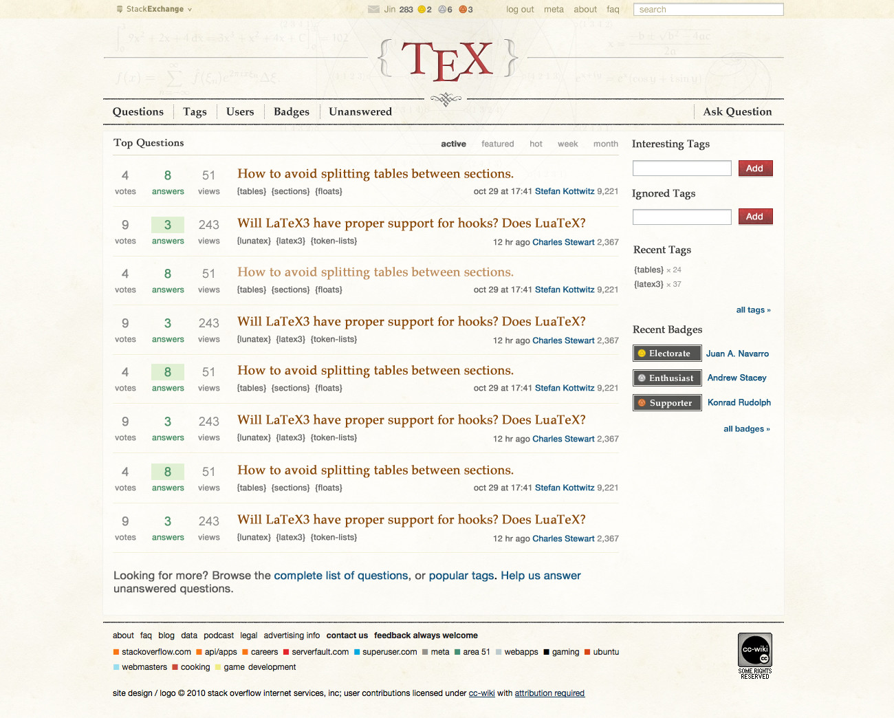
Thank you for all the helpful suggestions. Here's the initial design. While it doesn't have all the site element and details, it should give you an idea of the over all look and feel.

click on image to see full resolution version.

alt text

For the logo typeface, I used Hoelfer Text. Charles was right about my original choice of Trajan being too thin for the "E." The serif for the main navigation links, section header text and question titles is Palatino(Georgia for fallback in CSS).

The header background image is a montage of various shapes and equations produced by TeX. (Fourier Transform, Euler's Identity to name a few). I'm using them very very faintly. I want people to know they're there, but not get in the way. I also think the faint coloring works well against the paper texture. The serif typefaces and white space provide the beauty, and the subtle geometric shapes signify precision.

The overall color palette is a warm one. I feel it works well with classic look.

The rest of the page design is pretty straight forward. It has much familiarity from the Beta Sketchy theme, so existing users don't have to relearn the UI.

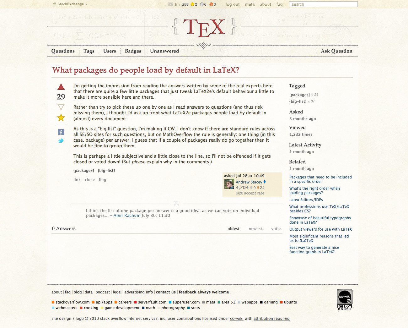
What's not shown is the Question page. It will have the same "shell" as the homepage. The Question/Answer/Comment body text will be a sans-serif font. I'm thinking about Helvetica Neue with Tahoma for fall back.

Update 2: Question Page Design

alt text

I decided to go with Lucida for the sans-serif typeface choice instead of Helvetica in the previous Homepage mockup, with Tohama for fallback. As @lockstep pointed out, Helvetica is a bit overused, plus I feel Lucida mixes better with Palatino. I made the lines in the badge icons fainter, as Charles suggested. The goal for the Question page is to be clean and readable.

Please let me know what you think.

12
  • 8
    It's great, really great. The faint montage is gently hypnotic: the geometric shapes in the middle provide an nice accent. One distracting element: the triangle in the badges at the top seem too bold, although that's not a problem with them in the "Recent Badges" side bar: fading the lines of the triangle a little should alleviate this. I can't find anything else to pick nits about. Will you be putting up a draft of the qn page? Commented Nov 10, 2010 at 14:25
  • For the most part, I really like the design. However, does it have to be Helvetica as sans-serif? It's worn out and IMO wasn't the most beautiful font from the outset. How about a humanist sans-serif like Gill Sans, Syntax or Myriad? Maybe even Optima is worth a try for the body text.
    – lockstep
    Commented Nov 10, 2010 at 16:57
  • @lockstep: it needs to be a font that most people have on their computer. The most common browser doesn’t yet support loading fonts from the web. I imagine even if it did, it would be a licensing problem.
    – Caramdir
    Commented Nov 10, 2010 at 17:32
  • 3
    @jin: I really like the overall design! How does changing {TeX} to {TeX}nique or {TeXnique} look?
    – Caramdir
    Commented Nov 10, 2010 at 17:35
  • 1
    @lockstep I'm not set up Helvetica. I have been looking at humanist types. I may go with Lucida since it's websafe with Tahoma for fallback.
    – Jin
    Commented Nov 10, 2010 at 18:29
  • @Charles, agreed on the fading lines on the badges. I just posted the mockup for the Question Page.
    – Jin
    Commented Nov 10, 2010 at 19:20
  • 1
    Very nice design! I like it. I think {TeX} provides a really nice impression symmetry for the header. On my screen, the geometric appear very faint indeed, I starred at the page for nearly 1 minute before I noticed them...
    – mpg
    Commented Nov 11, 2010 at 2:56
  • @mpg, On my screen, the geometric appear very faint indeed - Same here: I didn't consciously see the montage until my second look. I think that works very well: it accents the significant content elements without distracting from them. @Jin: I'm happy with the new badges. @lockstep: See List of Web Safe Fonts, though in fact there are more fonts that nearly all browsers have. Commented Nov 11, 2010 at 7:11
  • 2
    When using Lucida (and I love it! Much nicer font than Helvetica, IMHO), please notice that on OS X, “Lucida Sans Unicode” is actually called “Lucida Grande” for some weird reason. So to make sure OS X doesn’t fall back to Tahoma, both these font names have to be mentioned.
    – Konrad Rudolph Mod
    Commented Nov 11, 2010 at 15:43
  • 1
    I like the background as it is, but things like that are usually very screen dependent (for example on the one I am using now the grid background of the beta design is clearly visible, but on my laptop it is nearly invisible).
    – Caramdir
    Commented Nov 11, 2010 at 16:18
  • @Jin: great final design. Thanks a lot for the effort.
    – Konrad Rudolph Mod
    Commented Nov 11, 2010 at 21:24
  • @Jin: Can you confirm the actual equation used in the design here: Sign error in Euler's formula in header on front page?
    – Werner Mod
    Commented May 14, 2018 at 21:05

8 Answers 8

14

Jin, a very good design! I'm happy to see that. The letter-pressed effects are great and I like the warm colors. I'm just not so much happy seeing the red, yellow and blue colors on the left of a question. For instance, the yellow favourite symbol could be a bit warmer fitting to the paper-like background. The highlighted voting triangle could be filled with a darker color from the warm paper-like palette. It doesn't need to be red to be distinguishable from the not-filled voting symbol.

The rectangle badges look a bit boring to me. Some fancy ideas could be

  • a lying book with the badge name on its spine, like a leather bound book with gold, silver or bronze decoration

  • a calligraphy pen with the badge name, the tip color gold, silver or bronze

Or the upvoting and downvoting buttons could be a calligraphic pen tip pointing up or down. TeX deals also with beauty of fonts, so why not use a pen tip like seen in Charles' answer regarding Zapfino Ink.

Curly braces around the tags are a nice idea since they are for grouping in TeX. Similar with the logo, thus the logo {TeX} looks like a general tag for the complete site.

Regarding the header: I think there's too much math in the header. Perhaps it could indicate other uses like a nice scientific table (bootabs), a letter beginning (Dear ...) or a stock phrase hinting a book text like Once upon a time or ... and they all lived happily ever after.

9
  • 2
    I've already voted for your ideas first time round so can't do so again! But let it be known that I agree with all of these. Not sure about a table, but how about a chemical formula?
    – Andrew Stacey Mod
    Commented Nov 11, 2010 at 16:53
  • Stefan, good suggestions on the voting arrow and stars. I'm tweaking the design accordingly. For badge treatment, I feel anything fancier would clutter the overall design. Keep in mind, the badges appear as repeated items in a group. While your idea sounds good for ONE, they'll look very busy together. As for the header background, can you post any urls for me for other types of equations?
    – Jin
    Commented Nov 11, 2010 at 17:04
  • Or physics... or a nice typeface study. tug.org/texshowcase could give an inspiration, or ctan.org/pkg/titlepages or (more modern) TikZ trees, flowcharts, plots or diagrams from texample.net/tikz/examples as known. I think of balancing maths/science and general typesetting, classic and modern.
    – Stefan Kottwitz Mod
    Commented Nov 11, 2010 at 17:09
  • @Jin: yes, fancy badges would be too much, repeatedly, gone to far. If I imagine badges as upright books, a lot of them together would look well like a bookshelf, suiting TeX uses for book typesetting. Imagine a collection of leather bound (with gold/silver) books, titles for the badge, and a volume number on the spine standing for the quantity.
    – Stefan Kottwitz Mod
    Commented Nov 11, 2010 at 17:15
  • 2
    @Stefan thanks for the links. I may not be able to work the badge idea in today, but I definitely will tweak it some post launch. I'm a bit swamped atm, launching two sites today. Yours is one of them :)
    – Jin
    Commented Nov 11, 2010 at 17:24
  • @Jin: when I first read this comment, the page was still using the temporary theme. Then I hit "refresh" and the new design was there. Great work, many thanks!
    – mpg
    Commented Nov 11, 2010 at 21:27
  • @Jin what other site did you launch? btw, I love the look of the site :) Commented Nov 11, 2010 at 23:08
  • @wrongusername IT Security security.stackexchange.com launched for private beta today.
    – Jin
    Commented Nov 12, 2010 at 5:21
  • @Jin: nice, I'm interested in IT Security. Too bad I cannot commit any more now and therefore cannot see anything during the private beta. I followed the Network Security site but it has been closed as duplicate. It would be good if followers/committers of a duplicate site could join the other site after closing instead of having the choice between becoming locked out or committing to all possible duplicates too.
    – Stefan Kottwitz Mod
    Commented Nov 12, 2010 at 11:07
12

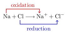
Collection of possible header images

This post is CW, so feel free to add more.

3
  • Can we have 'reduction' in English :-)
    – Joseph Wright Mod
    Commented Nov 11, 2010 at 17:42
  • @Joseph: if you insist...
    – Caramdir
    Commented Nov 11, 2010 at 18:07
  • really appreciate the links. thanks.
    – Jin
    Commented Nov 11, 2010 at 18:32
10

Hi Jin,

Good to meet you! I think we're all quite excited at the prospect of "graduating". I'm equally sure that you'll get lots of opinions on design since, as you saw, good design goes right to the heart of what TeX is about.

The first thing that springs to mind is the name and logo. We're down-playing the "LaTeX" in the title a bit. In brief, although the majority of the questions tend to be LaTeX-oriented, we definitely don't want to give the impression that LaTeX is the only TeX-extension allowed. So since LaTeX is the de facto default, it's important not to make it the de jure default as well as that could easily lead to this site being LaTeX-only and that is definitely not what we want.

So I would go for just {TeX} for the Logo (could the "TeX" be typeset correctly as well?).

I'd also like to say that I do like the idea of using the "special characters" as part of the design.

Anyway, just my first thoughts. I'm sure others will have more to say.

1
  • good to know. thanks.
    – Jin
    Commented Nov 9, 2010 at 23:15
10

Collecting some ideas from an earlier thread, some of the key points that the look of the site should convey are: precision, quality and beauty.

I think we all would appreciate a style that, as you suggested, is clean and easily readable, with lots of white. People also suggested TikZ as a source of inspiration, in particular I would recommend to have a look at the TikZ Manual and the TeXample.net website.

A serif font for the logo, title, headings, etc. is a very good idea. But for the particular font used in the body of the site, people seemed to be keen on having a sans-serif font because it does tend to look better on screen, while serif fonts usually look better when printed on paper. I think that the “classic” think about TeX is not necessarily the use of serif fonts, but its obsession about the correct use of typography for clarity and ease of reading. There were suggestions about using Helvetica, but also concerns about the font (or decent alternatives) being available on most web browsers.

Finally, about the logo, most people seemed to like TeXnique, or something along those lines, to identify the site. What about having something like {TeX}nique or {TeXnique}? And indeed, please don't use LaTeX in the logo/title because we want the site to be open and welcoming to people using any format and not just LaTeX.

Personally, I also like the idea of letter-pressed effects in the title, headings.

7
  • @Juan, currently the site header text says TeX, LaTex and Friends. I assume we'll go with that as well for the final site? Regarding sans-serif font, I think we can stick with that for body font. A serif head text would contrast it well.
    – Jin
    Commented Nov 9, 2010 at 23:02
  • @juan thanks for the TeXample.net suggestion. I love the vector graphics generated there. see: texample.net/tikz/examples/rotated-triangle where can I find more graphics like that in public domain I can use as part of the design?
    – Jin
    Commented Nov 9, 2010 at 23:10
  • 3
    I like the idea of {TeX}nique a lot, since it's the origin of the name, and uses the special characters. I'd love TeX to be correctly typeset in the logo too. I agree with the idea of keeping only TeX for the logo. LaTeX is already in the header text (and a de facto standard as Andrew pointed out), this is enough IMO.
    – mpg
    Commented Nov 9, 2010 at 23:40
  • 4
    @Jin, @mpg, No, I think LaTeX should not appear in the logo, title, headings or anything. The consensus seemed to be that we want to drop the “TeX, LaTeX and friends” in favor of other alternatives
    – Juan A. Navarro Mod
    Commented Nov 10, 2010 at 7:07
  • 1
    @Jin, and for more example graphics, you could post in the site a question asking for the kinds of things you need. We have a handful of TikZ experts that could be of great help.
    – Juan A. Navarro Mod
    Commented Nov 10, 2010 at 7:18
  • @Jin: I second Juan's suggestion to ask for designs on the site. We have thought of having the odd "competition" and this seems like a very good idea for one. You should specify some criteria, one of which should be that it should be generated by TeX, and post it on the main site. I'll happily add a bounty if you like.
    – Andrew Stacey Mod
    Commented Nov 10, 2010 at 8:26
  • The site looks excellent! If you wanted to add more TikZ flair somewhere, I have always been awed by some of the 3D examples on texample.net, see texample.net/tikz/examples/tag/3d especially spherical and cartesian grids, very pretty and very mathy! Commented Nov 12, 2010 at 3:59
5

For the curious with screens that fail to resolve the subtle color difference, here is what the header currently looks like after moving some sliders in Gimp to make things more visible. (Click for full size view.)

header

Most of the formulas seem to be typeset with Euler Math fonts.

4
  • Nice idea to make the background shapes better visible for the design phase! On my screen I couldn't see them very well.
    – Stefan Kottwitz Mod
    Commented Nov 11, 2010 at 16:19
  • "Now we see but as in a browser, darkly ...". Now I see it clearer, I like it less. I like the Cayley graph, that's nice, but it's obscured by that triangle and there's not enough of that triangle to make it clear so I'd vote for that going. I agree with Stefan about the preponderance of mathematics. Let's have one bit of maths (Euler's formula came up top on MO, I recall) and some others. I like the "happily every after". To have some science, how about a chemical formula? I also think that the sphere unbalances it: it destroys the symmetry.
    – Andrew Stacey Mod
    Commented Nov 11, 2010 at 16:52
  • 1
    at the first glance I thought you wanted me to go super grunge style :)
    – Jin
    Commented Nov 11, 2010 at 18:11
  • @jin I hope the upvotes don’t mean that others would want you to do that.
    – Caramdir
    Commented Nov 11, 2010 at 18:35
4

Restricting my thoughts to fonts; I agree with Juan's remarks about logo and that the theme should reflect "precision, quality and beauty." Sorry for all the scrolling that the following requires.

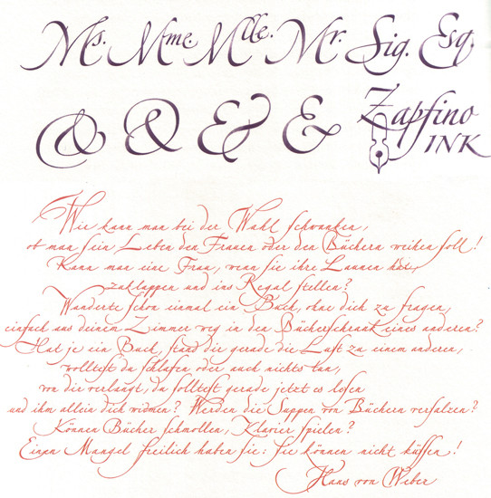
I like the idea of "good classic style", and raced off to look at some of Hermann Zapf's efforts (Zapf worked with Knuth for a patch, on Knuth's maths fonts). Something like Zapfino Ink (rom http://www.stepinsidedesign.com/STEP/Article/28799/): alt text

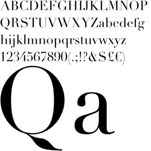
is attractive, and the swashes and flourishes are showy, but it makes me wonder if there is a danger that this kind of thing would make the site look somewhat antique and not being all that focussed on precision? This seems to be a danger with any of the more flowery fonts. Fitting the serif theme is the very modern Linotype Didot (from http://www.linotype.com/13354/linotypedidotroman-font.html): alt text

Linotype Didot is somewhat reminiscent, to me at least, of Knuth's Computer Modern, but with the decorative elements being more bold where CM can be a bit fussy.

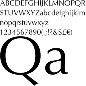
I think serif is probably alright, but might Zapf's not-very-serif Optima work? (From http://www.linotype.com/12540/optimaroman-font.html)

alt text

The other two points: "vintage paper texture" - it's a great idea, but I wonder about the antique association again. Maybe just paper texture would work with a more up-to-date look? I'm very happy with "letter pressed effects" - this emphasises that we care about text that are held in the hand.

2
  • maybe vintage wasn't the correct word since it gives that "worn" idea. I'll experiment with different textures and post the design later tonight or AM tomorrow. For font I still prefer to use a websafe font, but for header logo I can use anything. I was thinking about using Trajan.
    – Jin
    Commented Nov 9, 2010 at 23:07
  • 1
    @Jin: I have a great deal of confidence in you, after seeing how the maths.sx site turned out. Trajan: nice serif on the "T" and "E", but the "E" is rather narrow - I wonder how the TeX logo will turn out with that. Web safe fonts: Palatino is another Zapf-created font. Commented Nov 9, 2010 at 23:48
3

I’m loving the sound of this. It seems to capture the essence of TeX very well indeed.

A few points:

  • I think most people agree that the standard TeX fonts (Computer Modern …) aren’t the most elegant. On the other hand, the Showcase of beautiful typography done in LaTeX thread refers to some beautiful LaTeX documents that could be used for inspiration.

  • About the title. There was a pretty strong consensus against “TeX, LaTeX and Friends” since that puts a special emphasis on LaTeX while unduly de-emphasizing similar tool sets that play an equal role.

  • I think the tag line (if any) should be placed prominently, in particular if the site name is going to be a bit oblique. For example, I really love the site design of CrossValidated – but there’s no indication that this is a site about statistics! I had to look at the URL to see that.

  • I really like Charles’ first suggestion of using the Zapfino font in the design, e.g. the logo (even though Charles himself has doubts). I believe using a Zapf font would be very fitting; not only is Hermann Zapf kind of the ultimate font designer, he also worked very closely with Knuth.

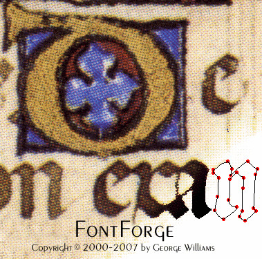
    The perceived danger that this would make the site look too antique, and not enough focused on precision could be mitigated by “resolving” the strokes into vector outlines or guide lines, like in this picture:

    FontForge logo

    Of course this is rather too specific and I’m not a designer. I just wanted to mention that I think a font like Zapfino could be made to work.

All in all, I’m very excited to see the final layout!

1
  • I wasn't able to work Zapfino Ink font in because it did make the site antique looking, also I felt it made the design "typeface" busy. As for the tag line, when a user visits the site for the first time, we have a new user welcome box on the sidebar telling people what the site is about.
    – Jin
    Commented Nov 10, 2010 at 13:43
3

Comments on the current mockup:

  1. I didn't know I'd gotten the Enthusiast badge!

  2. I find the geometric shapes behind the {TeX} a bit crowded. It looks as though that triangle from texample is in there, but as it gets truncated and hidden behind the logo then I feel it gets a bit lost.

  3. There's a little bit of inconsistency in the faint equations on that banner. The Fourier Series one uses italics but the others are typeset in upright shape. Most TeX output puts the mathematics in italic.

  4. I'm definitely unhappy with the statement of the Fourier Series! Where did that come from?

But those are very minor quibbles. Overall, it looks very nice.

6
  • @anndrew, thanks the comment. I want the the visuals to look as authentic as possible. I'll replace the FT one. As for the triangle and the other graph, they fade into the page content a bit intentionally, instead of being cut off after the header.
    – Jin
    Commented Nov 11, 2010 at 3:37
  • Andrew, @Jin: I don't really see the montage well enough to comment on the content of the equations: maybe it is good if Jin posts the unfaded version of the montage? If the montage is as faint as I see it, then the crowded geometric shapes isn't a problem: it is just accenting, but I can imagine that it becomes distracting if it is rendered less faintly. Commented Nov 11, 2010 at 7:17
  • @Charles, @jin: yes, I'd like to see the unfaded version too. I also think I'd like to see a version of the page where it was rendered less faintly. If it's so faint most people don't notice it, what's the point of it? But obviously, it shouldn't be prominent. Also, I'd still like the Fourier series replaced by something, and the integration stands out a little as it is of no particular significance (compared to the others). How about Faraday's law of induction (integral formulation) - especially as it's not just mathematicians who use TeX.
    – Andrew Stacey Mod
    Commented Nov 11, 2010 at 8:19
  • I also only noticed the montage after reading about it above and thinking "huh, what montage are they talking about?" But I still think it's good that it's so faint. So: appearance of the montage is great, content should indeed be improved. Commented Nov 11, 2010 at 9:13
  • @Hendrik: I certainly don't want it to "jump out" at the user, but if people only notice it when they've been told about it, then I wonder if it's doing anything at all (maybe it is, on some subliminal level).
    – Andrew Stacey Mod
    Commented Nov 11, 2010 at 10:37
  • @Andrew: Sorry, I wasn't explicit enough. But you said what I meant: I think the subliminal level will be reached, and that suffices. Commented Nov 11, 2010 at 10:42

You must log in to answer this question.

Not the answer you're looking for? Browse other questions tagged .