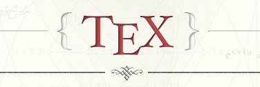
I really love the beautiful shaded TeX.SX logo — I think it makes tex.stackexchange.com one of the best looking of all the StackExchange sites.

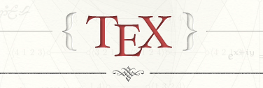
But I am curious why the kerning is wrong? (By that I mean it doesn't follow Knuth's kerning of the TeX logo.) Should it not look more like this?—

The latter shows the E lowered by 1 pixel and the T and X each moved 6 pixels closer to the E. It's subtle, but it feels more "TeX-like" to me that way. Anyone agree/disagree?
