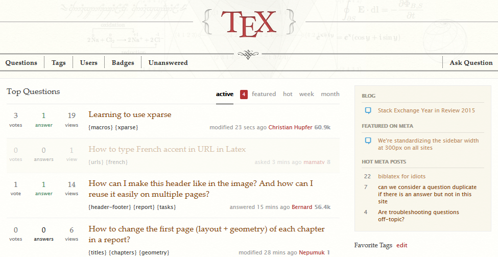
I've noticed this for quite some time, but I suppose the time has come to do something about it. At least for me to speak about it, hoping to cause some change.
Links on TeX SE Main are invisible. Hard to locate unless you really put the cursor on. The color is a blue so dark it's almost black and it basically blends with the rest of the text. This is how it looks on Tex, can you see them?
If you couldn't see them fast enough, there's a problem. There were three links in that screenshot. Here's where they are:
And here's the text version, if you want to test it:
Lorem ipsum dolor sit amet, consectetur adipiscing elit. Donec lacus eros,
pellentesque vel elit at, pretium porttitor nulla. Vestibulum eget quam vitae nisi
semper sagittis sit amet [sed dui](http://tex.stackexchange.com/).
Curabitur elit neque, ultricies sit amet dictum nec, molestie non leo.
Ut pellentesque lectus quam, at posuere nibh hendrerit sit amet.
Vivamus [at](http://tex.stackexchange.com/) condimentum odio. Mauris
pulvinar [ligula](http://tex.stackexchange.com/) a ornare accumsan.
Aliquam consequat vitae nibh in feugiat.
In comparison others sites have much more visible links, and that's how it should be. I picked two examples from non-beta sites, because the beta sites have very bright blue links and they are all visible, while on non-beta sites, themes change and we can see various versions. And that's another point: why are the links on this site blue when the theme is mostly yellowish with some maroon and red?


