The SEDE queries suggested by samcarter (https://data.stackexchange.com/tex/query/888155/average-answer-score-by-tag) and me (https://data.stackexchange.com/tex/query/950955/) in the comments show the average answer score. The average, however, is very sensitive to outliers and therefore probably less useful to analyse 'your average question'. A more robust measure such as the median might be more useful.
fun, cervantex, big-list, research and triskaidekaphobia are amongst the top tags by average answer score. Not only are there very few questions with those tags, they are also not representative of the majority of questions on this site.
Many tags also have a small number of highly-voted questions. Some of these questions are about common pitfalls and therefore often linked, some have evolved to go-to duplicate questions, others are of very wide interest or just produce interesting, unexpected, or stunning output. Those questions are usually also not representative of the voting behaviour for that tag.
Based on the following query https://data.stackexchange.com/tex/query/951095/average-answer-score-by-tag that gives the number of answers for a given score and tag I came up with the following crude R script (the data was downloaded to tag-score-answercount.csv). It analyses the 16 tags with more than 5000 answers (to keep things manageable)
sede <- read.csv("tag-score-answercount.csv")
tags <- unique(sede$TagName)
tags.anscount <- sapply(tags, function (s) sum(sede$AnswerCount[sede$TagName==s]))

toptags <- tags[tags.anscount >= 5000]
toptags.anscount <- tags.anscount[tags.anscount >= 5000]

revectorise <- function(x, count){
  rep(x,count)
}

fd <- data.frame(tag=c(), score=c())

buildfakedata <- function(s){
  data.frame(tag=s, score=revectorise(sede$Score[sede$TagName==s], sede$AnswerCount[sede$TagName==s]))
}

for (s in toptags){
  fd <- rbind(fd, buildfakedata(s))
}

histlims <- c(min(fd$score), 20)
breaks <- seq(histlims[1], histlims[2])
opar <- par(no.readonly = TRUE)
par(mfrow=c(4,4))
par(mar=c(1,1,1,1)+0.1)
for (s in toptags){
  hist(fd$score[fd$tag==s & fd$score<=20],
       breaks=breaks, xlim=histlims, ylim=c(0,.23), freq=F,
       ylab=NULL, xlab=NULL, axes=FALSE, main=paste("Histogram for", s))
}
par(opar)

bp <- boxplot(score~tag, fd, outline=FALSE)
title("Answer score by tag")
abline(h=0,lty=3)
abline(h=median(fd$score))
abline(h=mean(fd$score), col="red")
means <- tapply(fd$score,fd$tag,mean)
points(means,col="red",pch=19)

scorecutoff <- 50
fdtrim <- fd[fd$score <= scorecutoff,]

boxplot(score~tag, fdtrim, outline=FALSE)
title(paste("'Typical' answer (score <=", toString(scorecutoff), ") score by tag", sep=""))
abline(h=0,lty=3)
abline(h=median(fdtrim$score))
abline(h=mean(fdtrim$score), col="green")
means <- tapply(fdtrim$score,fdtrim$tag,mean)
points(means,col="green",pch=19)
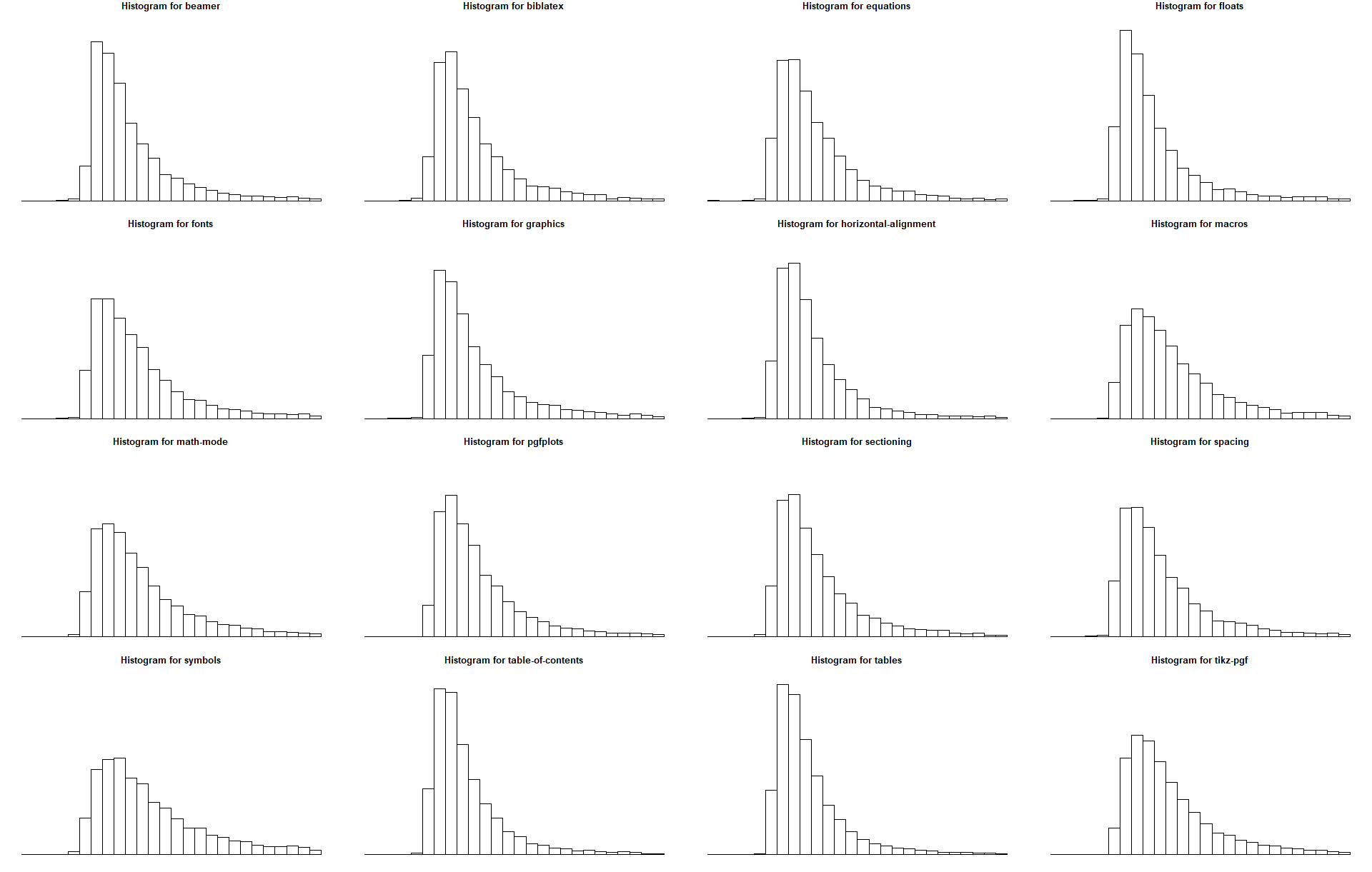
The histograms are chopped off at +20 (arbitrary cut-off) and -6 (the absolute minimum score in the 16 tags). They show the probability/relative frequency and all have the same bin sizes (intervals of one from -6 to 20) as well as the same y axis (from 0 to 0.24)

Here table-of-contents, floats and tables show comparable poorer scores with very light tails and a high concentration on the lower bins. symbols and math-mode have heavier tails (i.e. a higher proportion for answers with higher score).
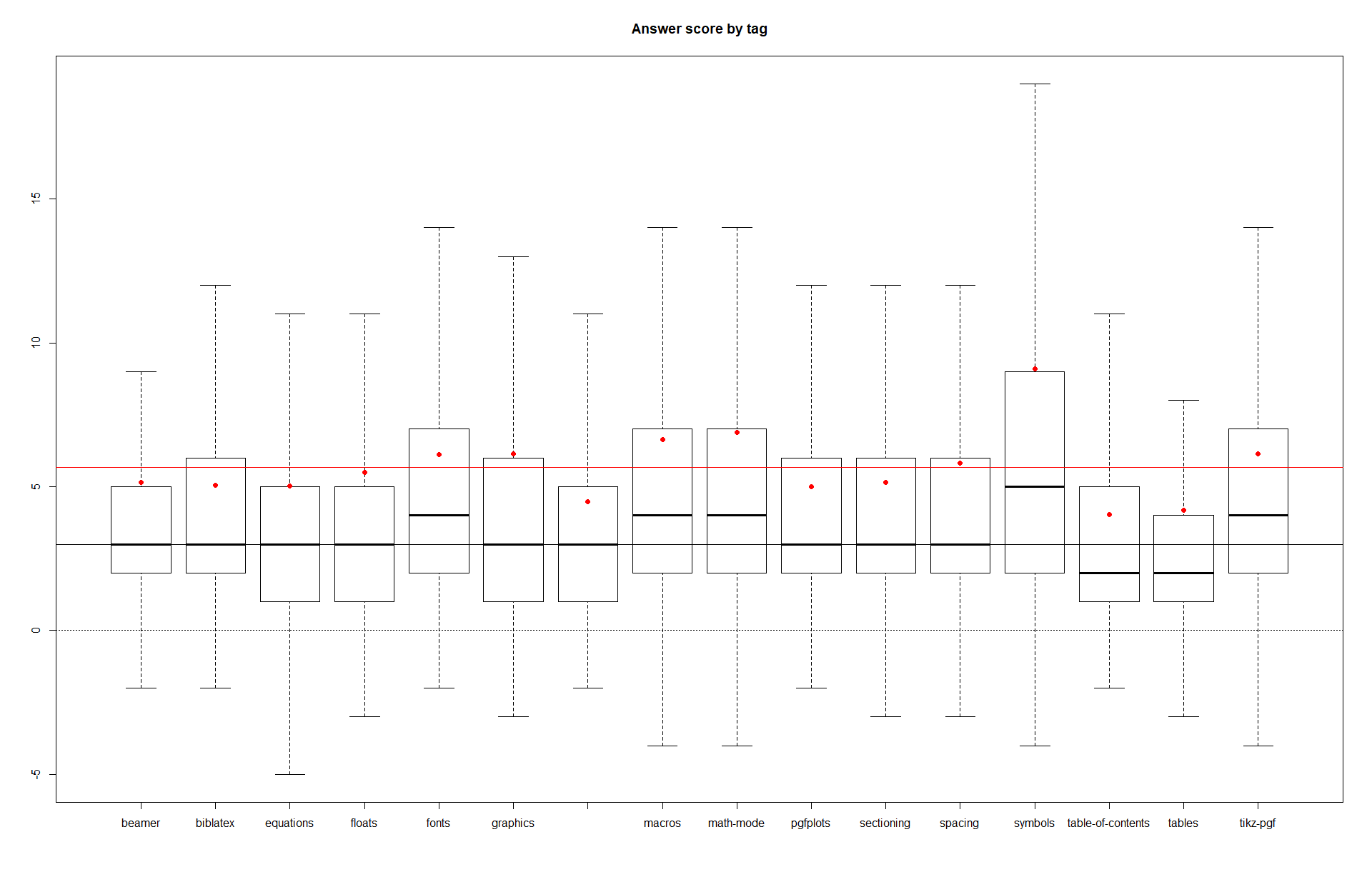
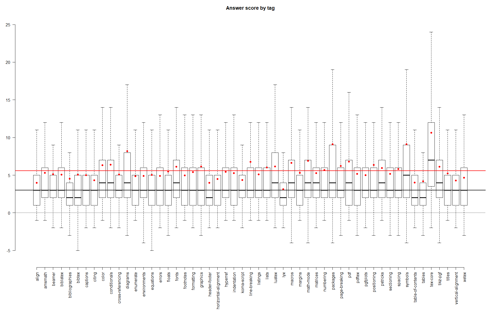
The following box plots show scores over all answers for a tag. The red dot marks the mean answer score for a tag, the red line shows the overall mean. The whiskers extend up to 1.5 times the IQR from the box.

The plots confirm the intuition we got from the histograms that table-of-contents and floats perform worse than the other tags. symbols, math-mode, macros, fonts and tikz-pgf show higher median scores.
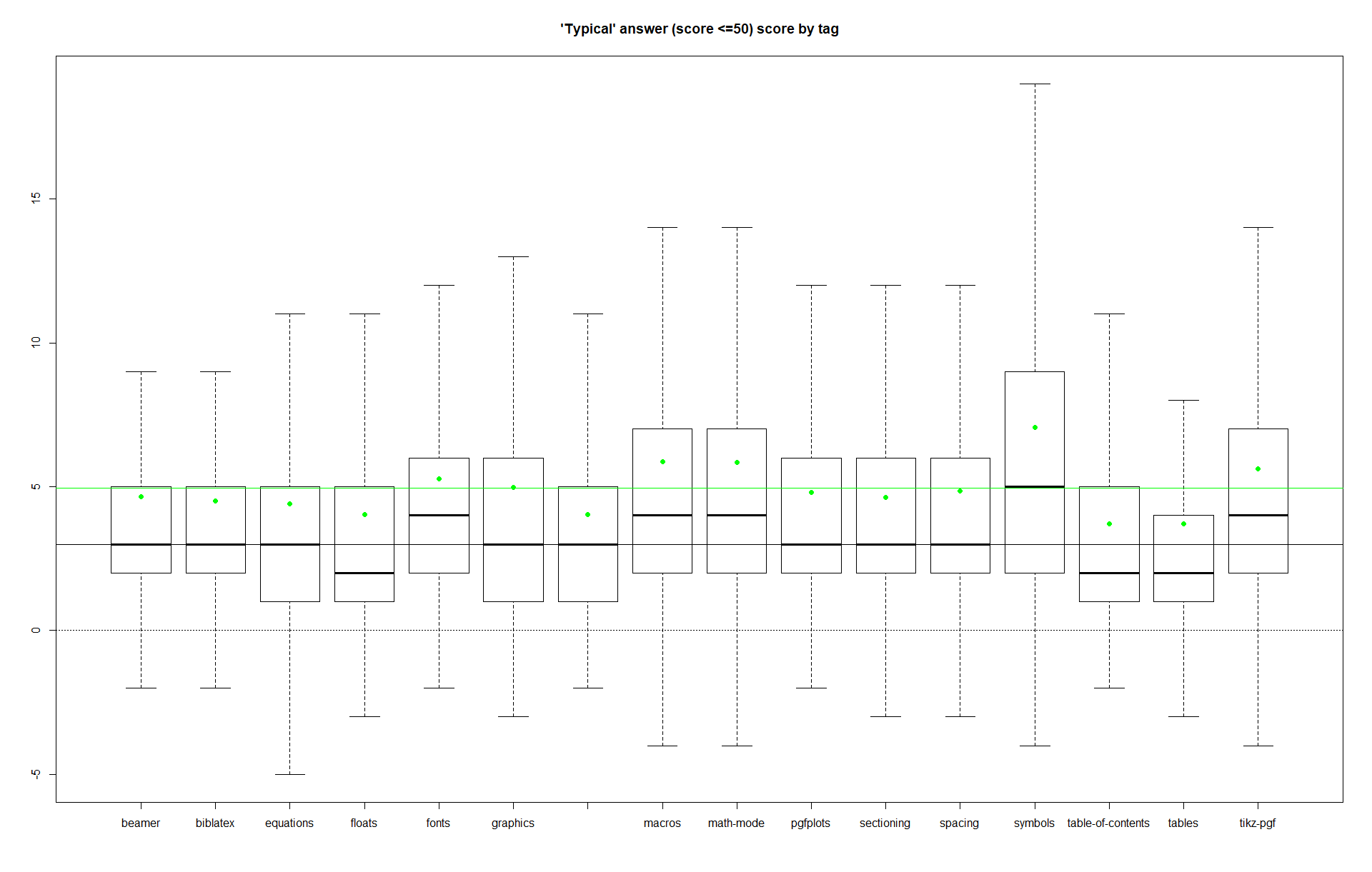
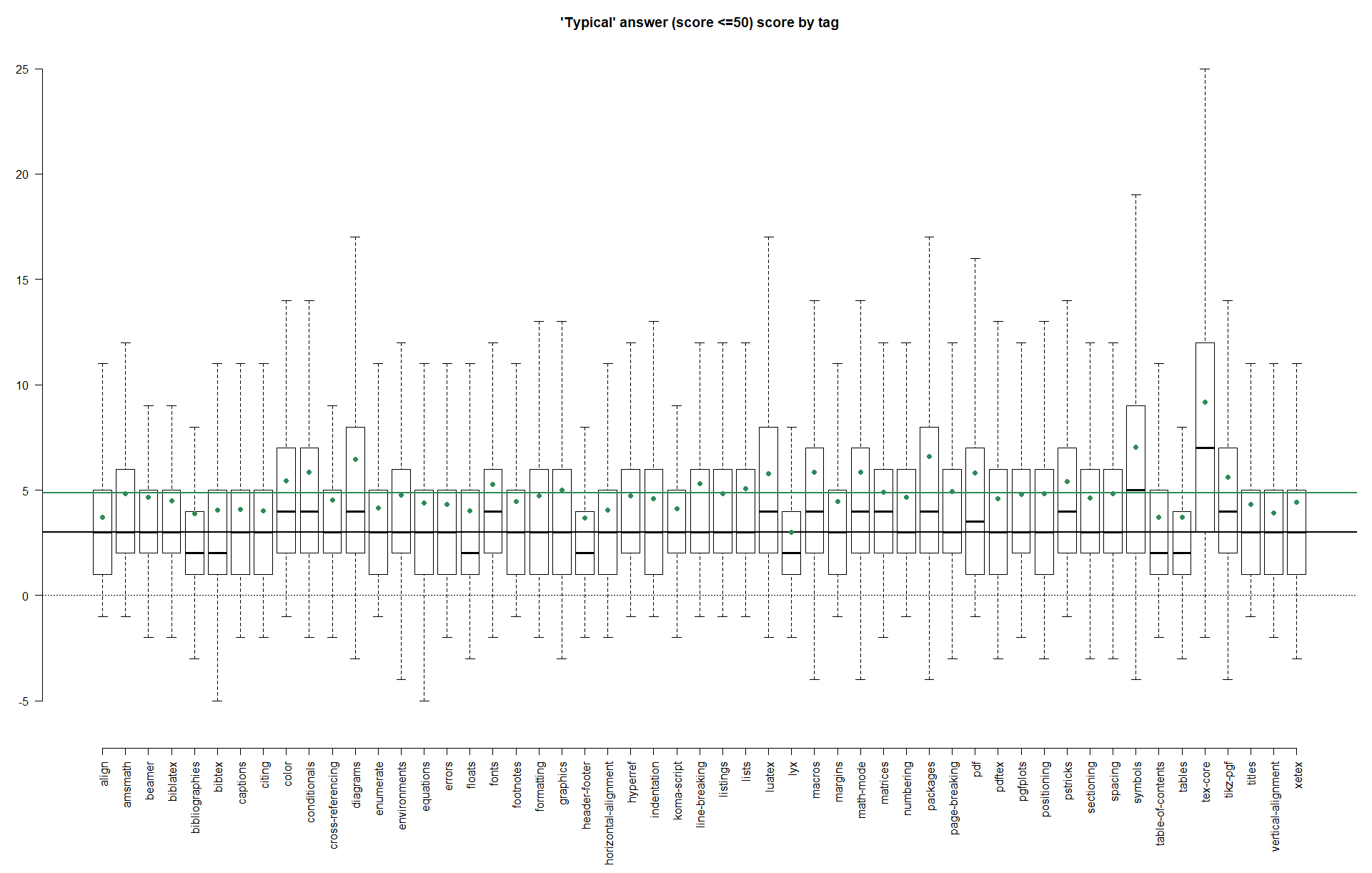
As mentioned above, highly-scoring outliers can skew the results so that certain tags appear to perform better than they usually do. Since boxplots rely on more robust quantile measures, big changes are not expected if outliers are excluded, provided there are only a few. The following plots are restricted to answers with scores of no more than 50. This time the green colour shows the means.
As expected the mean goes down (after all the mean is very susceptible to outliers), but perhaps less expectedly there are subtle changes in the boxes for biblatex, floats and fonts. At least for biblatex that change seems to be down to the fact that the 0.75 quantile is just at the border between 5 and 6 (the full data set has the border at 0.747/0.748, the reduced set at 0.751/0.752, this difference of 0.004 comes down to about 25 answers on a total of 6242 answers) which means that removing even few high scoring answers (28 answers in this instance) can let the quantile drop. I haven't looked into the other tags, but I suspect similar effects.

A word of warning: We are dealing with integer data whose overall distribution seems 'pretty close'. Mean and standard deviation are quite susceptible to outliers, but even the more robust measures of our box plots can't escape small side effects, so that differences of ±1 may well be due to edge effects rather than a stable underlying trend (see the changes in the plots for biblatex examined above). The median score over all tags is three, one additional vote can have quite the effect there. If one wants to compare specific tags, looking at the boxplots and histograms alone won't cut it.
Here is a slightly more sophisticated (but still naive) version of the script above. The interesting things are now packed up in functions, so they are easier to reuse.
The data still comes from https://data.stackexchange.com/tex/query/951095/average-answer-score-by-tag
sede <- read.csv("tag-score-answercount.csv")
tags <- unique(sede$TagName)
tags.anscount <- sapply(tags, function (s) sum(sede$AnswerCount[sede$TagName==s]))

cycle.colours = c("blue", "red", "seagreen", "deeppink", "orange")

# concentrate on tags with more than cutoff.ansnum answers
cutoff.ansnum <- 2000
toptags <- tags[tags.anscount >= cutoff.ansnum]
toptags.anscount <- tags.anscount[tags.anscount >= cutoff.ansnum]


# This function plots the "tails" of the score distribution,
# i.e. the relative frequency of answers with score at least s
# input: scorevec  a vector of scores
#        sort      a TRUE/FALSE flag on whether to sort the tags
#                  by the tail frequency for the first score
plot.scoretails <- function(scorevec, sortby=NA){
  # no vectorisation here :-(
  a <- matrix(NA, nrow=length(toptags), ncol=length(scorevec))

  for (i in 1:length(toptags)){
    a[i,] <-
      sapply(scorevec,
             function(s) sum(sede$AnswerCount[sede$TagName==toptags[i] & sede$Score>=s])/
               sum(sede$AnswerCount[sede$TagName==toptags[i]]))
  }

  if (!is.na(sortby) & is.element(sortby, scorevec)){
    a.sort <- a[,match(sortby, scorevec)]

    toptags <- toptags[order(a.sort)]
    a <- a[order(a.sort),]
  }

  ylim = c(0,max(a))
  plot.colours <- rep_len(cycle.colours, length(scorevec))

  par(mar=c(9,4,4,1)+.1)
  magicoffset <- 0.028
  plot(a[,1], type="o", pch=19, col=plot.colours[1], ylim=ylim, xlim=c(1,(1+magicoffset)*length(toptags)),
       xaxt = "n", xlab=NA, ylab=expression(F(X>=s)), frame=F,
       main="Rel. frequency of answers with score at least s")
  for (i in 2:length(scorevec)){
    points(a[,i], type="o", pch=19, col=plot.colours[i])

  }
  text(length(toptags)+magicoffset*length(toptags), a[length(toptags),],
       labels=sapply(scorevec, function(s) as.expression(bquote(s==.(s)))), col=plot.colours)

  axis(1, at=1:length(toptags), labels=toptags, las=2)
}

plot.scoretails(c(3,4,5,6,10,20), sort=10)
plot.scoretails(c(5,7,10,12), sort=5)

plot.scoretails(c(8,10,15,18,20), sort=20)

plot.scoretails(c(80,100,250,200), sort=80)

# to make things easier for histograms and boxplots we reverse engineer a data frame
# with the data for each "answer"
revectorise <- function(x, count){
  rep(x,count)
}

fd <- data.frame(tag=c(), score=c())

buildfakedata <- function(s){
  data.frame(tag=s, score=revectorise(sede$Score[sede$TagName==s], sede$AnswerCount[sede$TagName==s]))
}

for (s in toptags){
  fd <- rbind(fd, buildfakedata(s))
}

# histograms are arbitrarily chopped at 20
histcutoff.right <- 20

histxlims <- c(min(fd$score), histcutoff.right)
breaks <- seq(histxlims[1], histxlims[2])
opar <- par(no.readonly = TRUE)
par(mfrow=c(4,4))
par(mar=c(1,1,1,1)+0.1)
for (s in toptags){
  hist(fd$score[fd$tag==s & fd$score<=max(histxlims)],
       breaks=breaks, xlim=histxlims, freq=FALSE, ylim=c(0,.24),
       ylab=NULL, xlab=NULL, axes=FALSE,
       main=paste("Histogram for", s))
}
par(opar)

# Boxplots
plot.boxplot <- function(fd, ylim=NA, showMean=TRUE, showSD=FALSE, col="red", title="Answer score by tag"){
  par(mar=c(9,3,3,1)+.1)
  if (missing(ylim)){
    bp <- boxplot(score~tag, fd, outline=FALSE, las=2, frame=F)
  }
  else{
    bp <- boxplot(score~tag, fd, outline=FALSE, ylim=ylim, las=2, frame=F)
  }

  title(title)
  abline(h=0,lty=3)
  abline(h=median(fd$score), lwd=2)
  if (showMean){
    abline(h=mean(fd$score), col=col, lwd=2)
    means <- tapply(fd$score,fd$tag,mean)
    points(means,col=col,pch=19)
    if (showSD){
      sds <- tapply(fd$score,fd$tag,sd)
      points(means+sds,col=col,pch=1)
      points(means-sds,col=col,pch=1)
      abline(h=mean(fd$score)+sd(fd$score), col=col, lwd=1, lty=2)
      abline(h=mean(fd$score)-sd(fd$score), col=col, lwd=1, lty=2)
    }
  }
}

plot.boxplot(fd, ylim=c(-6,25), showMean=TRUE, col="red")


# we exclude outliers by considering only answers with score no more than 50
# the first plot verifies that this is not too bad,
# this should cover more than 90% of questions per tag
# for the more common tags even more than 97%
typcutoff <- 10
fdtrim <- fd[fd$score <= typcutoff,]

typfreq <- sapply(toptags,
                  function (s) sum(sede$AnswerCount[sede$TagName==s & sede$Score<=typcutoff])/
                    sum(sede$AnswerCount[sede$TagName==s]))

plot(typfreq, type="o", xaxt="n", xlab=NA, frame=F, ylab=NA)
title(paste("Rel. frequency of answers with score no more than", typcutoff))
axis(1, at=1:length(toptags), labels=toptags, las=2)


plot.boxplot(fdtrim, ylim=c(-6,25), showMean=TRUE, col="seagreen",
             title=paste("'Typical' answer (score <=", typcutoff, ") score by tag", sep=""))


# plot empirical distribution or survival function (tail probability) for list of tags
# restrict the plotted x range with xlim to see local behaviour
# ymin is usually 0, but for small x ranges it might be convenient to get auto-detect with ymin=NA
# survival plots (almost) the survival function F(X>=s) instead of the distribution function F(X<=s)
plot.ecdf <- function(tags, xlim=NA, ymin=0, survival=FALSE){
  if (missing(xlim)){
    xmin <- min(sede$Score[is.element(sede$TagName, tags)])
    xmax <- max(sede$Score[is.element(sede$TagName, tags)])
  }
  else{
    xmin = min(xlim)
    xmax = max(xlim)
  }

  xseq <- seq(xmin,xmax,1)

  plot.colours <- rep_len(cycle.colours, length(tags))

  a <- matrix(nrow=length(xseq), ncol=length(tags))

  if (survival){
    cdf.f <- function(x,i=i){
      sum(sede$AnswerCount[sede$TagName==tags[i] & sede$Score>=x])/
        sum(sede$AnswerCount[sede$TagName==tags[i]])
    }
  }
  else{
    cdf.f <- function(x,i=i){
      sum(sede$AnswerCount[sede$TagName==tags[i] & sede$Score<=x])/
        sum(sede$AnswerCount[sede$TagName==tags[i]])
    }
  }


  for (i in seq_along(tags)){
    a[,i] <- sapply(xseq, function(x) cdf.f(x, i))
  }

  if (is.na(ymin)){
    ymin <- min(a)
  }
  ymax <- max(a)

  par(mar=c(5,4,4,2)+.1)
  plot(xseq, a[,1], type="o", pch=19, ylim=c(ymin,ymax), col=plot.colours[1],
       xlab="Answer score", ylab="Rel. frequency")
  if (length(tags)>1){
    for (i in 2:length(tags)){
      points(xseq, a[,i], type="o", pch=19, col=plot.colours[i])
    }
  }

  if (survival){
    legpos <- "topright"
    title <- "Empirical survival function (tail probabilities): Score at least s"
  }
  else{
    legpos <- "bottomright"
    title <- "Empirical distribution function: Score less or equal than s"
  }
  title(title)
  legend(legpos, tags, pch=19, col=plot.colours, title="Tag", bty = "n")

}

plot.ecdf(c("cross-referencing", "lyx", "biblatex", "luatex", "tikz-pgf"), xlim=c(1,4), ymin=NA, survival=T)
plot.ecdf(c("cross-referencing", "lyx", "biblatex", "luatex", "tikz-pgf"), xlim=c(0,10), survival=T)
plot.ecdf(c("cross-referencing", "lyx", "biblatex", "luatex", "tikz-pgf"), xlim=c(0,20), survival=T)
plot.ecdf(c("cross-referencing", "lyx", "biblatex", "luatex", "tikz-pgf"), xlim=c(10,20), survival=T)
The script analyses more tags (here all tags with at least 2000 answers, but that can be modified in cutoff.ansnum).
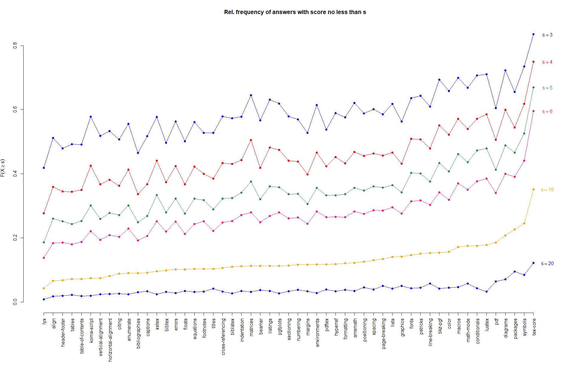
The following plot shows the relative frequency of answers scoring at least s by tag. The list is sorted not alphabetically but by the relative frequency of answers scoring 10 or more (that's why the curve for s=10 has no bumps, while all other curves have ups and downs). The lines are just there because I found them easier on the eye than just points, but they serve no real purpose. In particular there should be no implication that the points on a curve somehow influence each other or should follow a particular shape.

Again symbols scores quite well, but the absolute top tag here is tex-core. lyx (perhaps unsurprisingly), bibliographies and tables perform below average.


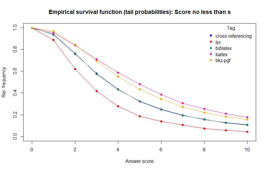
As mentioned above it might be quite interesting to compare several tags directly. The plot below shows the 'survival function' or 'tail probabilities' of scoring at least s. A higher probability/relative frequency would be better. For more detailed interpretations it would be necessary to compare the behaviour of these functions over several 'windows' of x/s ranges.
